
Your online store’s design plays a massive role in its success (or lack thereof). To put it simply, why would visitors to your site trust your site enough to make a purchase if your store’s design looks like it was ripped straight from the early 2000s.
More importantly, good design practices and usability often go hand in hand.
If you focus on creating an e-commerce store that both looks fantastic and is a joy to use, it becomes easier to grow a loyal customer base. Although web design can be subjective, there are several tried-and-true best practices you can follow to ensure your store is up to code.
In this article, we’ll dig deeper into why design plays such a fundamental role in your online store’s success. Then I’ll introduce you to six approaches to maximise conversions in your e-commerce site through design. Let’s get to it!
Why Your Store’s Design Plays a Major Role in Conversion Rates
I’m a big believer that a website doesn’t have to be gorgeous to be successful. However, following best web design practices often leads to a better user experience. The more intuitive your online store is, the higher conversions tend to be.
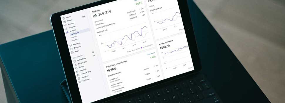
To be fair, there are a lot of factors beyond design that can influence your sales. However, assuming there’s a demand for your products and that you’re getting decent traffic, you should be getting standard e-commerce conversion rates. Even for highly successful stores, those rates tend to oscillate between one and two percent, though. The rest of your visitors may simply not be ready to make a purchase (for a variety of reasons).
Generally at Pixelrush we see that our most profitable campaigns are for sites that can achieve a conversion rate within the 2-3.5% range.
There are four fundamental ways in which your store’s design can impact sales, and they are:
- By providing all the information users need to make a decision at a glance.
- By improving your store’s navigation, making it easier to find other products.
- By ensuring your store looks professional and trustworthy.
- By creating a store that is easy to use and never frustrating to interact with.
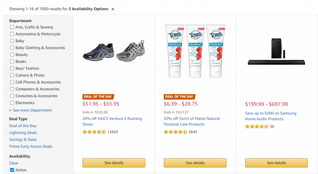
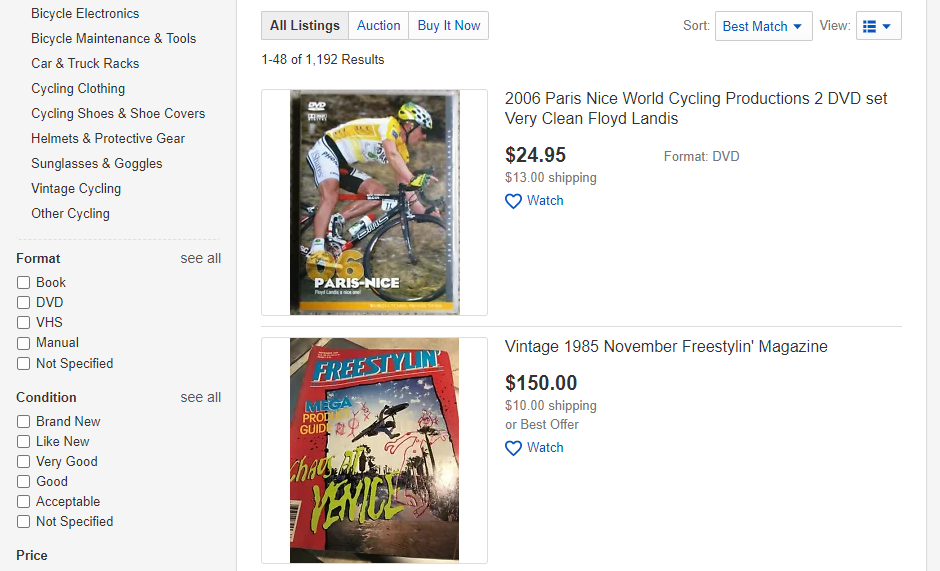
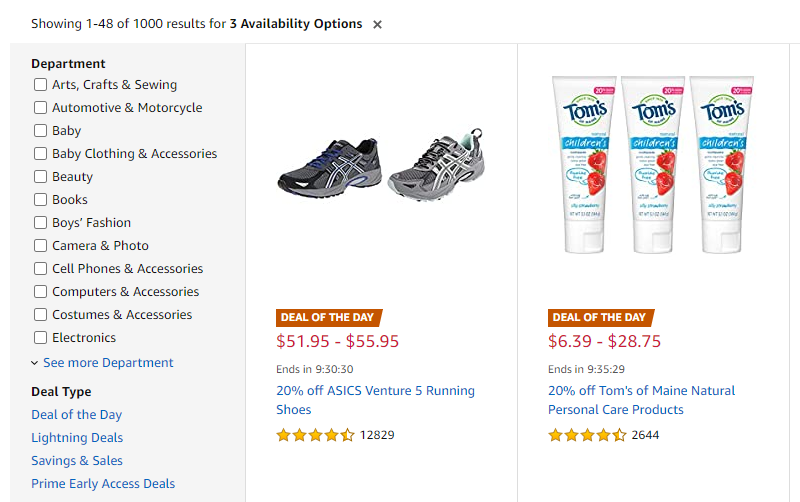
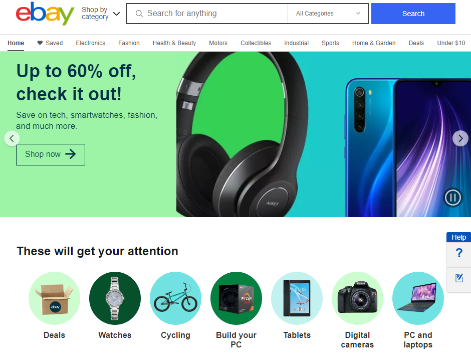
Unlike other types of projects, e-commerce sites can get away with a lot more ‘clutter’ in their design. Take Amazon, for example – they throw dozens of elements at you on each page, but the website itself remains easy to navigate:
Other online stores opt for more minimalistic approaches. What type of design you want to use is up to you, as long as you follow basic guidelines to ensure your store is user-friendly.
In the next section, we’ll explore several ways to ‘improve’ your store’s design for increased conversions, focused on the fundamentals we mentioned before.
6 Ways to Maximize Conversions on Your E-Commerce Site
It’s important to re-iterate there’s no such thing as a one-size-fits-all style for online stores. There’s infinite room to impart your own style into your store. That is, as long as you make an effort to ensure that it offers an enjoyable shopping experience. With that in mind, let’s talk about product images.
1. Feature High-Quality Product Images
As much as you may be accustomed to shopping online, we’re willing to bet you wouldn’t want to purchase a product that doesn’t feature a single image. That applies even if you’re 100% sure about what you need – there’s something about a lack of product photographs that’s a major turn off for online buyers.
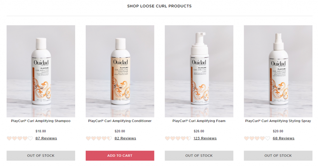
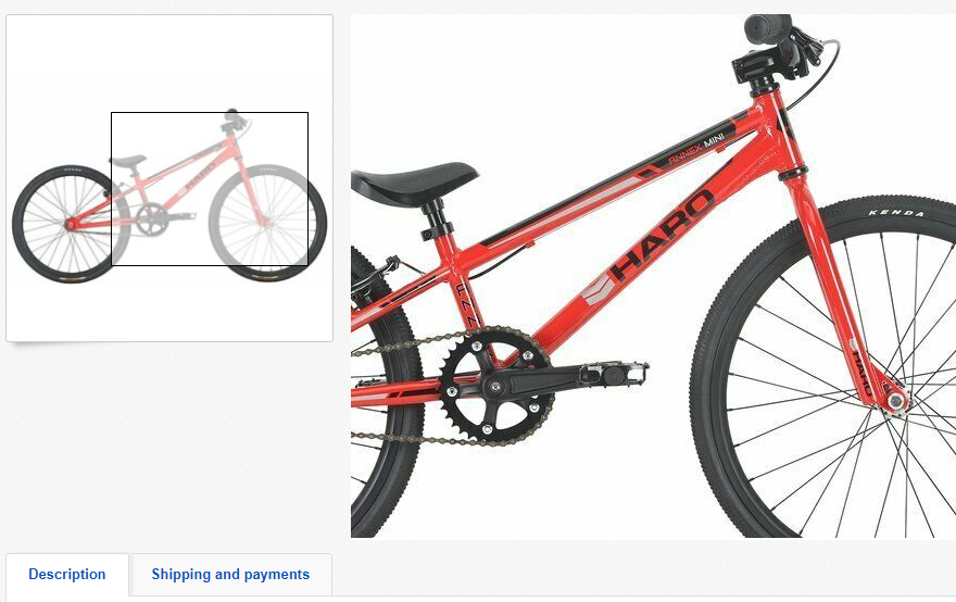
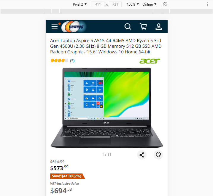
Ideally, every item on your online store should come with a set of multiple accompanying images. Every single one of those images should be high-quality enough for potential buyers to get a good idea of what they’re buying. Bonus points if you enable zooming in on pictures:
Product images become even more important with high-ticket items and you’re more likely to get discerning buyers. However, that doesn’t mean you can get away with not posting images even for products worth only a few dollars.
Major online retailers have an edge because they can afford professional shots for all the items on their catalogs. These days, though, we all carry around devices capable of taking high-quality pictures. If you don’t have room in your budget for professional shots, consider taking your own:
If you already accompany all the items on your store with great photographs then you’re good to go, so let’s talk about what else you should be doing.
2. Display Customer Reviews Front and Centre
If your store focuses on selling very specific products in volume, then you need to enable customer reviews. User reviews fulfil four key roles when it comes to helping you secure additional sales:
- They tell prospective customers they can trust your store.
- They show that you sell high-quality items.
- In-depth product reviews can help new buyers find you through search engines.
- Reviews often provide much more information than most stores offer in product descriptions.
To sum it up, as long as you sell products you’re confident in, there’s no reason why you shouldn’t enable customer reviews. If you don’t sell good products, then you have much bigger problems than following good design practices.
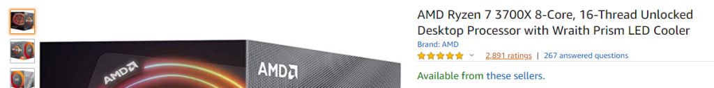
For reviews to help you boost conversions, they need to be easy to find. In most cases, customers are used to seeing reviews at the bottom of each product’s page:
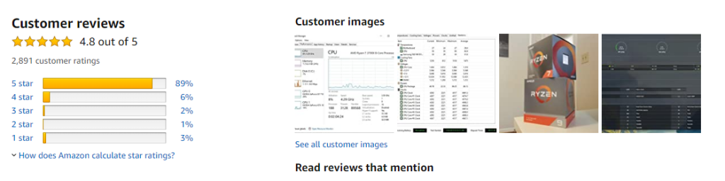
Another smart design choice is to show each item’s rating right next to (or beneath) its name:
Ideally, users should be able to click on that rating and jump straight to the reviews themselves. Some customers trust other users above all marketing copy, so you want to make sure they can easily find each item’s reviews.
3. Optimize the Checkout Process
In a perfect world, it would never take users more than a few minutes to complete an online purchase. The more convoluted your store’s checkout is, the higher the chances are that some buyers will drop out as they move from stage to stage.
There are several ways you can optimize your store’s checkout. However, by far the most impactful change you can make is to compress it into as few pages as possible. Bonus points if you can provide a one-page checkout:
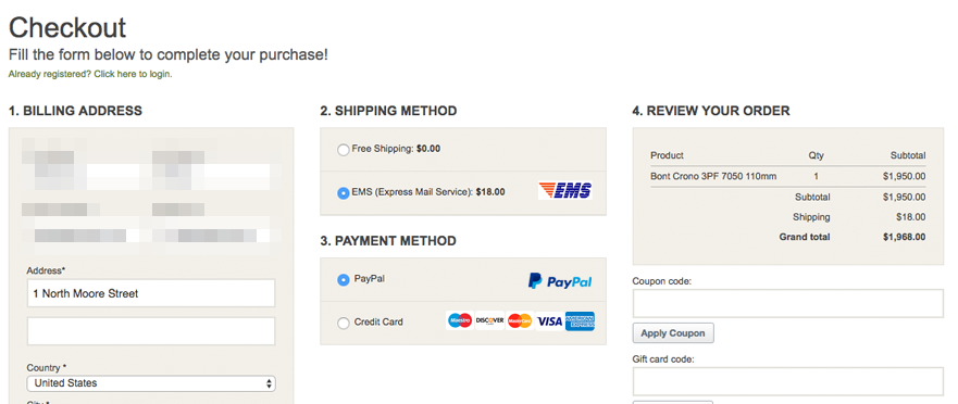
In practice, one-page checkouts aren’t always viable. If a lot of your store’s users are on mobile devices, then multi-stage checkouts might be easier to navigate. That also applies if you need to collect lots of information for your payment provider.
Even if you have a multi-stage checkout process, it should be easy to navigate. Each field customers need to fill out should be intuitive. On that same note, you have to be very upfront about shipping costs and available payment methods.
Ideally, customers should know what types of payments you accept and how much shipping will cost before they take out their wallets. That way, there’s less chance that they’ll get cold feet during checkout. Adding shipping calculators and payment processor logos to your product pages go a long way towards minimizing that risk.
4. Ensure Customers Know About Discounts and Special Offers
There is perhaps no better way to increase sales than to offer discounts and special deals on products. However, that tactic only works if visitors are aware the discounts exist in the first place.
One mistake some online stores do is rely entirely on off-site marketing (such as mailing lists) to promote deals. Email marketing can be incredibly powerful, but sending a sales message doesn’t mean you shouldn’t update your website to promote special offers.
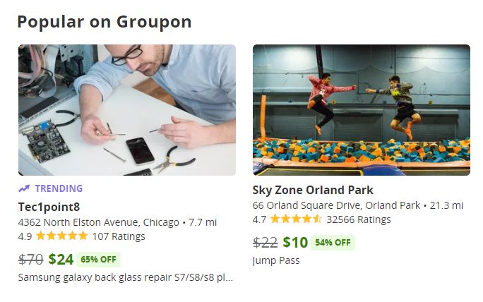
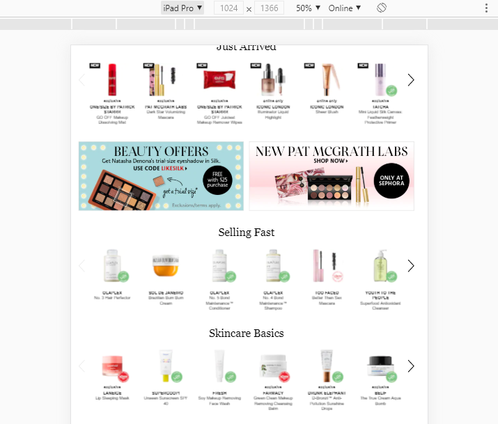
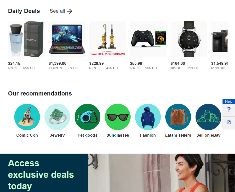
There are a thousand ways you can do this. For example, a lot of major online retailers showcase rotating discounts as part of their homepages:
Items that are on sale should include identifying markers of some kind. You can add labels to product titles, add slashes to prices, and even use ‘on sale’ labels on top of images:
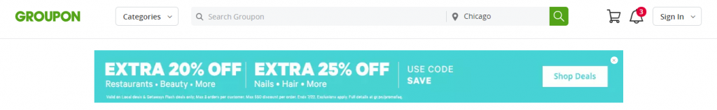
If you’re offering sitewide discounts or coupons that work for entire product categories, then you can eschew subtlety altogether. For those types of offers, you should always place an announcement at the top of your homepage:
Promoting sales and discounts more aggressively not only helps you increase conversions – but it also minimises the risk of unhappy customers. If you have someone purchase an item without knowing there were cheaper alternatives, they may be more likely to return it or leave a bad review. The better the deal they get, though, the more likely they are to purchase from you again in the future.
5. Optimize Your Store for Mobile Devices
Gone are the days where most people browsed the web through desktops and laptops. Now, most of your site’s users probably visit your store using a phone or another type of mobile device.
That change is not inherently bad. However, it does mean that you need to adopt a mobile-first design perspective when it comes to your online store. Here’s what that means, in a nutshell:
- Your store should be easy to navigate on small screens.
- Users shouldn’t have to struggle to press on buttons or to swipe through images.
- Visitors shouldn’t have to zoom in to be able to read text on your site.
All those considerations might sound like common sense. However, you’d be surprised at the number of popular online retailers that offer a subpar shopping experience for mobile users. Take this beauty products store (which shall remain unnamed) which doesn’t resize content for mobile devices:
Ultimately, providing a great user experience on mobile boils to down to adjusting your content for smaller resolutions and user interactions that rely on screen presses instead of mouse clicks:
At this stage, we encourage you to take a good hard look at your online store using as many mobile devices as you can get your hands on. If you feel at any point the mobile experience could be improved, then it’s important you take the time to do so.
6. Design a Strong Landing Page
With most websites, you may not want to come out of the gate swinging with product offers. Instead, you want to take your time to woo visitors before you go for the sale. E-commerce sites are a different matter entirely, though.
When it comes to online stores, visitors are there for one thing only and you both know what it is. They want to spend their money, so your best bet is to dive into product showcases from the get-go:
As we mentioned before, visitors are often more forgiving of online stores when it comes to design clutter. That means you can have a lot of fun with your store’s landing page and use it as a portal to lead customers to the product categories they want and to showcase deals and recommendations:
Your store’s homepage has one simple goal and that is to get visitors to click on something. You want them to commit to navigating your store for at least a few minutes in the hope that they find the products they’re looking for. If you have a compelling homepage that makes your store easy to navigate, then the chances that they’ll jump ship are much smaller.
Conclusion
If your store is receiving a lot of visitors but you’re not getting that many conversions, it may be time to take a closer look at its design. In many cases, what may seem like small design changes can have a significant impact on your store’s user experience, which often translates to increased sales.
Some examples of such design changes include the six fixes we discussed previously, which are:
- Feature high-quality product images.
- Display customer reviews front and centre.
- Optimize the checkout process.
- Ensure customers know about discounts and special offers.
- Optimize your online store for mobile devices.
- Design a strong landing page.
Do you have any questions about how to maximise conversions on your e-commerce website? Let’s talk about them in the comments section below!