
When it comes to Google Ads, you might find yourself focusing on things like your Click Through Rate, Cost Per Click (CPC), Cost Per Lead (CPL) or simply whether your ad is appearing higher than your competitors (admit it, you know you’re looking!).
While those metrics can be important, they are only 50% of the equation.
In the last 7 years, I have spent over 10 million in ad spend and optimised over 400+ landing pages.

Image: Screenshot taken in July 2021, showing my Ad Spend for the previous 90 days.
And what it’s taught me is that a bad website is like fly spray to your visitors. It’s as if some websites have been designed to deter your best visitors from converting (you don’t want that!).
Today I’m going to share with you the 7 top lessons I’ve learned so that you don’t have to spend all that money and all those years making the same mistakes I’ve made to master it.
Hint: One of these tips resulted in a 5-figure increase in sales to my client in just 30 days (but more on that later).
I promise you will slash the amount of wasted ad spend, frustrated prospects, and unconverted traffic your landing pages have been producing… and you’ll skyrocket your google ads results!
But first, let me explain a couple of things to make sure we’re on the same page… (hah see what I did there?) *grin*
New customers are the lifeblood of any business.
As business owners, one of our top must-do’s is to create a well-oiled engines for lead generation that keep new prospects flowing into our marketing funnels — and then converting them into paying customers.
Instead, what usually happens is this…
A Real Life Google Ad Example: How to Lose Red Hot Leads in 60 Seconds
Imagine you own a boutique luxury hotel in Sydney.
Now picture your typical customer. Let’s call her Sam.
Sam’s 30th birthday is coming up and she wants it to be relaxing, luxurious and extra special.
Her 4 best girlfriends agreed to celebrate with her in Sydney. They want to book two suites for a 4-day long weekend.
She just needs to find the perfect hotel.
They’re looking for one with a fine-dining restaurant, breathtaking views, a pool, a gym, and a spa.
It must be near swanky bars. Huge bonus if there’s a live jazz spot nearby.
Even better if it’s a saunter away from a luxury shopping mall, so she can splurge on designer shoes and statement jewelry.
You have exactly what they want. In fact, your hotel is their best option.
“Best luxury boutique hotel in Sydney with great views, pool, and spa”, she Googles, using her mobile phone.
Sam sees one of your Google Ads. It mentions great views, a pool, and a spa.
Sam feels a rush of excitement as she clicks your ad.
She lands on your website’s home page.
(This is a big no-no, and I’ll explain why in a minute…)
Sam sees that some elements aren’t formatted properly.
“Maybe because I’m on my mobile phone,” Sam thinks, undeterred.
She sees pictures of the hotel logo and the facade.
Where are the great views, pool and spa the ad “promised”?
“Hang on, am I at the right place? Is this hotel even in Sydney?” she wonders.
She clicks around, but the pages are a tad slow to load.…
Luckily, Sam is being fueled by her birthday fantasies so she overlooks your website’s glacial pace.
She finds the spa but can’t locate any info about what beauty treatments and pampering packages you offer.
She checks out the restaurant, but she can’t see the menu anywhere, so she checks what’s nearby.
It mentions hospitals, golf courses, parks and schools — but none of those interest her.
She spots the phone number of your hotel, but she’s at work.
Suddenly, her boss appears down the corridor and she’s heading towards Sam.
Sam clicks away and forgets all about your hotel.
Whatever your business is, chances are, your prospects are having a similar experience.
It’s an unnecessary waste.
And I want to put an end to it.
I no longer want you to spend money to get qualified, warm buyers, only for them to leave, frustrated and empty handed.
And it’s clear what needs to happen:
If you’re advertising on Google Ads (or you plan to) optimising your landing page(s) is key. Fail to prioritise it and you’ll just be flushing your money (and the Sam’s of this world) down the drain.
But before we get to the lessons, let me first clarify the difference between a landing page and a website homepage.
Landing Page VS Website: What’s the Difference?
Well, two things: purpose and focus.
Think of it as: a website is a General Practitioner while a landing page is a Specialist doctor.
A website’s homepage caters to all types of visitors:
Whether cold or warm traffic, problem-aware or solution-aware, whether they’re there to read your blog or to report issues, the homepage directs visitors to the different areas of your site depending on the specific information they’re after.
An effective homepage makes a good first impression and then gives visitors compelling reasons (and makes it dead easy) to explore deeper.
Whereas a landing page is designed for a specific campaign or offer, with a specific conversion goal (a conversion goal could be a phone call, a subscription, a booking, an enquiry, a trial, or a purchase.)
If you click on an ad that promises “Fun, muscle-building 20-minute workout program for high-performing boss-babes” because you identify as that person…
Aren’t you more likely to convert if it leads to a page talking only about THAT program versus a page showing 12 exercise programs for people of varying lifestyles and physical abilities?
(I call this “perfect match”: when the search term, ad copy and landing page content all match. Pro Tip: aim for perfect matches in your campaigns).
And that’s the problem with taking prospects to your website’s default home page when they click on your Google Ads: they’re going to be directed towards a million things, some of which don’t interest them.
And we know by now that distraction = low conversion.
That’s why, when you use Google Ads to drive traffic to your business, it’s best to create high-converting, custom landing pages, each catering to a targeted market segment who have specific needs.
The more custom landing pages you create, the more targeted your message becomes, and the more effective it will be at converting.
Companies that increase their number of landing pages from 10 to 15 see a 55% increase in leads (Hubspot)
Now that we’re all on the same page, let’s tackle the do’s and don’ts that will help your landing pages convert…
Lesson 1: Customer empathy is the foundation of Conversion Optimisation.
One of the biggest causes of poorly performing landing pages is that it has little to no understanding of who the visitor is, their pain points and where they are in the customer journey.
Ever heard of the saying, “if you want to build high, you must first go deep”?
One of the tallest skyscrapers in New York, One World Trade Center, took 6 years to build. Out of those, three years were spent building the “below ground” portion of the structure: the foundation.
Well customer empathy is the foundation of conversion optimisation.
How well you align with your “target who” is going to determine your results.
If you don’t understand your prospects on a deep level…
- You won’t have “product-market fit” (offering a product that effectively meets your target customers’ needs).
- You won’t be able to clearly convey the true value of your offer to them.
- Your messages and offers will have little or no emotional resonance with them.
When prospects feel that we don’t understand their pains, they tend to believe we can’t possibly help them.
So before you do any selling, do the “below ground” work first: understand and truly know the people you intend to serve.
A big part of having customer empathy involves putting yourself in their shoes to anticipate what they need (so you could give it to them).
So ask yourself:
- “If I were my target prospect, what would I want to find on this page?”
- “What would be my concerns and doubts?”
- “What immediate questions would I want answered?”
Here’s an example of a page that didn’t immediately answer the questions their prospects were looking for:

Rec Xpress Before Optimisation
If you’re looking to join a gym, and the first thing that I (the salesperson) do is shout in your face: “NEW CLUB NOW OPEN!”(then I rattle off our locations and show you my Instagram pics on my phone)…Would you join?
No, you’d probably either leg it or inch your way towards the exit.
Businesses with low customer empathy behave this way.
Customer empathy allows you to anticipate — and thus meet — the best interests of your target prospects.
And that’s one of the things we did when we gave the Rec Xpress page a make-over.
Compare the previous screenshot to the “after” version:

Rec Xpress Website: (“After”)
Notice how:
- In one glance, anyone can understand the many benefits Rec Xpress offers.
- The images portray the prospects’ “aspirational self”: fit, disciplined, strong, energised, etc. This stokes their desire to be a better version of themselves.
- We anticipated the most common objections and provided answers in advance.
Night owl? No problem. We’re open all night!
Morning lark? No problem. We’re open all day!
Low budget? No problem. At $11 per week, we’re the best value gym ever.
You live far from branch A? No problem. We have 4 other branches — one is bound to be near your home or workplace!
Don’t like joining fees or contracts? No problem. We don’t, either!
Are you getting ideas about how you can apply these to your own business?
I hope so. Because those changes in Rec Xpress’ home page resulted in:
- 150% increase in organic conversions
- 35% increase in organic traffic
- 104% increase in Google conversions.
Imagine getting those conversion improvements yourself!
How To Develop Customer Empathy
Talk to your target prospects and customers one-on-one to understand their pain points.
Some questions you can ask people who fit your target profiles are:
- “What do you hate/dislike about [your kind of solution]?”
For example if you’re in the gym business, ask: “what do you hate about gym memberships?”
If you’re in the airline business, ask: “what frustrates you about flying?” - “Describe to me your “moments of struggle” as you deal with problems that my product solves.”
- Could you talk me through last time that moment of struggle happened?
- What are the implications if you fail to solve that problem?
- What’s wrong with the solutions you already tried?
- Can you describe your ideal solution? (Follow up: why would you want that? What would that let you do? And how are you coping without it?)
Some questions for your existing customers:
- “If you think of my product as “a worker”, what specific job(s) are you hiring it for?”
- “How is your life better/happier/healthier/richer (you get the idea) because of my product?”Press for details. The more ultra specific they are, the better your understanding of them will be.
- “Do you use any alternatives? In what ways is it better at getting “the job” done?”
A tool I highly recommend is the Customer Empathy Map.
The Customer Empathy Map
Look at the questions in the image carefully:

Customer Empathy Map Template
(You might find it helpful to put a face of your typical target profile in the middle of the map.)
If you have several target profiles, make one for each profile. For example, if you’re a hotelier you could be catering to:
- A mother who’s organising their next family holiday.
- A groom-to-be shopping around for the best honeymoon getaway.
- An executive secretary looking to book a private, secluded suite for her boss’s secret high-stakes poker game.
As you can imagine, the priorities and needs of each profile are different.
Successful businesses are sensitive to these nuances.
Here’s a very simple version of a completed Customer Empathy Map:

Completed Empathy Map
Then, apply the insights you gather to inform the design of your ads, landing pages and website.
Use them to reduce the anxiety (any psychological discomfort that a user experiences) and friction (anything that slows the user down or makes it hard for them to accomplish a task) on your page.
Lesson 2: Before you optimise the more complex elements of your landing page, make sure everything is working properly first.
Testing if everything on your landing pages is working as it’s supposed to is one of those low-hanging fruits.
You’ll be surprised how many of these are often neglected.
Maybe because it’s easy for us to overlook the simple, basic things.
A good example is slow loading pages.
What many business owners don’t realise is that page load time matters A LOT.
According to Portent, conversion rates drop by 4.42% for every extra second of page-load time.
This makes sense because load time affects the user experience. The slower a page is, the more chances of users clicking away or spending less time on the page.
Google’s study also reveals that:

Image Source: Google
In fact, page load speed is one of the signals Google uses to rank pages so it affects your SEO.
A slow page speed could hurt your indexation because search engines can crawl fewer pages using their allocated crawl budget.
What makes pages slow? There are many possible causes, but some of the most common are:
- Unoptimised images
- Excessive Flash content
- Bloated code
- Your hosting package may not include optimisation services
- Not implementing browser/HTTP caching and server-side caching
You can evaluate your page load speed using Google’s Page Speed Insights tool.
Another opportunity worth mentioning is mobile optimisation.
Most people now spend more time surfing the web from their mobiles.
Therefore:
Mobile optimised landing pages = good user experience = increased conversions
Here’s an example of a site that’s not mobile optimised (the device this was viewed from was a less-popular Android phone):

Sample site that’s not mobile optimised (top)

Sample site that’s not mobile optimised (bottom)
As you can see, some elements overlap, some words are hard to read, and it’s hard to click on a link without accidentally clicking the one next to it.
So when we create landing pages for clients, we pay attention to how all the elements (especially the important ones) are displayed on mobile devices.
According to Nifty Marketing, 86% of the top performing landing pages are mobile-optimised.
For example, here’s the above-the-fold area of Great Southern Sunnies’ homepage when viewed on a desktop:

Great Southern Sunnies Homepage
Then if we check how it appears if viewed on an iPhone 6/7/8 Plus, the site adjusts to the device so that important Calls to Actions are above the fold and unmissable. Like so:

Great Southern Sunnies: Mobile Optimised Site
As you can see in the above screenshot, the “Shop Men”, “Shop Women” and “Shop Brands” as well as the logos of brands they stock — all appear above the fold.
Mobile experience optimisation isn’t merely a case of compressing or rearranging the content on the screen.
In fact, it involves changing some of the elements completely to better suit the mobile experience.
The goal is to make sure users can do any task without wanting to throw their phone against the wall.
Whether it’s checking out your offers, signing up, filling out an enquiry form, buying, etc…
The experience should be easy, seamless and rewarding.
So when you design the entire experience for smaller screens, I recommend you:
- Make buttons larger
- Minimise the need to pinch, zoom or scroll
- Make images lighter & smaller for faster page speed
- Make sure pop-ups aren’t disrupting the user experience (because no user ever said “Ooooh I just love it when something pops up on my screen and I can’t make it go away!”)
- Enable auto-fill form fields
- Maximise the use of explainer videos
Lesson 3: Relevance is the name of the game.
As visitors hit your page, the first questions they ask are:
- Am I in the right place?
- What is this all about? What does this business offer or do, and is it relevant to ME?
- Do I have good reasons to scroll down or explore further?
We have less than 5 seconds to answer those or they click away.
The more focused and tailored it is to the reader, the higher its chances to convert.
I call this Relevance.
There are many ways that could make your landing page irrelevant.
One is that it fails to appeal to the prospects’ specific motivations or buy buttons.
For example, if quality matters to Sam above all else but you’re emphasizing your lightning speed delivery, then your pitch is irrelevant to Sam.
Another is that there’s no “Continuity”.
If the ad Sam clicked promised “divorce lawyer specialising in complex, high-value divorces in Melbourne”, those words should also be there when she hits your landing page.
“Perfect matching” your search term with the ad and landing page copy ensures continuity.
Otherwise visitors feel a sense of disorientation.
Another issue is that there’s far too much “noise” on the page.
Let me show you a “noisy” landing page that we optimised and resulted in a lift in conversion rate….
Case Study: How Decluttering Lifted This Site’s Conversion Rate From 3% to 8%
See if you can view this website home page as if you’re their target customer:

Above-the-fold area of homepage (Before)
Here were some of the issues:
- Notice the way it’s formatted. There’s no element that’s being emphasised so nothing really grabs your attention. When we’re given far too many options, many of us end up making no choice at all. People either get confused or get anxious about making the “wrong decision”.
Research shows that putting multiple offers on your landing page can reduce conversions by 266% (TechJury)
- There are far too many elements competing for the user’s attention:
As a user, you don’t know where to look or what you should do first.
Do you watch the video?
Do you sign up for the newsletter?
Oh maybe you should watch the other video about why people are raving about them? - The text “Your pathway to happiness” is vague. You could say that about getting a pet llama, too.
Or bacon.
Or pineapple-topped pizza if that’s your thing.
My point is it doesn’t give users a concrete idea of how exactly it could improve their lives.Rephrase statements like these in your site because they create more questions than answers. - The Social Proof element — in this case a testimonial — is hard to read, so the site fails to earn users’ trust.
- The benefit statement, “We help up to 98% of our clients to recover from depression, anxiety, PTSD, anger, burnout, crisis, negativity, etc etc…”That paragraph helps contextualise what they do (which is great), but it’s not clear how one could get a free session.
Do you call them or fill out an application form?
Do you spin a wheel?
Hit a piñata?
How exactly does one get it? It doesn’t say.
Now compare it to the “after” version:

Above the fold area of homepage (After)
Here are some of the changes that increased the conversion rate and their leads per month from 30 to 60:
- We decluttered the entire page. We focused the entire “above the fold” area towards one thing: lead generation.
- We made sure there are Social Proof elements (video testimonials, the “as seen on” logos), and they all work together to create trust fast, thus giving visitors compelling reasons to book their free session.Also, it’s super clear (and dead easy) how to get the free session.
- We made sure we made them feel SAFE. We emphasised that the offer is risk-free and they’re protected by the guarantee.
- The yellow CTA button + the yellow telephone number stands out in that sea of blue, thus drawing the eye towards them (but without being aggressive or “hypey”).
- We removed the collection of low-quality stock photos.
We used only one photo above the fold, and it has plenty of empty space. This creates a relaxing ambience and calming feeling that people would expect from a mental health solution provider. - Also, initially this site used many images of people in agony and pain. We wanted to sell the outcome of the service more so than the problem.So we switched to images portraying happiness, calmness and inner peace. This conveyed the results prospects will enjoy if they use the service.
Lesson 4: A compelling Unique Value Proposition can be the difference that makes all the difference.
Once your website has established relevance in the prospect’s mind, it needs to answer “WHY YOU?” next.
Unless what you’re selling is so cheap that it can be an impulse buy, I guarantee that your prospects shop around.
They research. They read reviews, check out your competition, list pros and cons…
82% of customers read online reviews and these help to build trust. (BrightLocal)
They even create spreadsheets to compare their options. This applies especially when you’re in a B2B space.
Your Unique Value Proposition (UVP) is one of the greatest tools that could help or hurt you during this research phase.
Your UVP is your compelling answer to the question, “Why should I buy from YOU instead of your competitor?”
“We offer breakfast, lunch & dinner.” (Booo!)
“After touring around our organic farm, sit by the flower garden and savour a joyous feast with your loved ones. Lovingly prepared using time-honoured traditions and artisanal ingredients, our hearty meals are a revelation to the senses. Come home today to Casa della Nonna.” (Yay!)
“Website design services.” (Booo!)
“We skyrocket your business with a high-performing website designed to attract more targeted leads, more clients, and more sales.” (Yaayyy!)
See the difference?
When I talk about Pixelrush, one of the things I say is that when it comes to return on ad spend (ROAS), the Google Ads industry standard is: for every $1 you spend, you get $2.87 back. But we get back as much as $11.42. Then I present plenty of proof to back it up.
Another UVP I convey is that unlike other agencies, we don’t do the “set it & forget it”, “churn & burn” stunts that most PPC Agencies do.
We are proactive: we optimise campaigns weekly to maximise opportunities and also realise every potential.
We constantly identify wastages within each campaign so we can keep minimising them over time.
Can you start modeling those examples as you craft your own UVP’s?
Now let’s look at how to apply this when you want your page to communicate your UVP to your ideal prospects….

Rec Xpress – Unique Value Proposition
Looking at the screenshot above, notice how:
- We enumerated the Value Propositions so that they’re much clearer (and can be understood in one quick glance).
- When we fail to create exclusivity… that is, if prospects can get what you offer somewhere else, then they have no reason to act now. After all, there are others they can source it from.
So we gave them irresistible “reasons why” they should choose Rec Xpress: $0 Joining Fee, open 24/7, no lock-in contracts (among others) — and we presented them in an easy to digest way. This creates a huge boost in perceived value because they’re something that many other gyms don’t offer.
Here’s another one from Greenlight Environmental Services, a specialist in occupational hygiene, property risk and hazard identification…
This was the home page before we worked on it:

Greenlight Service (“Before”)
As you can see, there’s a Call to Action but it doesn’t give you any compelling reason to call them immediately. It also doesn’t explain the many problems that they can solve for you.
This is actually very common. Many business websites either have no UVP or they’re crafted very poorly.
Now compare the “before” with the “after” version, below:

Greenlight Environmental Services Homepage (“After”)
Can you spot the difference?
- The headline gives a succinct explanation of what Greenlight does.
- In one glance, you get an easy-to-grasp list of the many problems they solve.
- There’s social proof below the green Call to Action button.
- You won’t find a single cheesy stock photo anywhere on the site.
We also created a section that spelled out the many compelling reasons why you should book Greenlight:

Greenlight Environmental Services’ Unique Value Proposition
When I work with clients on redesigning their pages, at first they say empty rhetoric like “we care for our customers”, “we provide a high level of quality”, etc. It’s only when I mention a competitor’s name that they tend to “go deep”.
So when you craft your UVP, don’t just say things that anyone can say, too. Give specifics as to how you do what you do and why that is valuable or different.
Now it’s your turn to crystallise your compelling UVP’s! 😉
The Do’s & Don’ts of Crafting A Compelling Unique Value Proposition
Do:
Highlight aspects of your product or service that align with the prospects’ top pains, needs and buying motivations.
Say you’ve always manufactured perfumes in big bottles. Then someone had the brilliant idea to make miniature sized ones. Suddenly sales shot up because it allowed ladies to slip their favourite perfumes into their purses wherever they go.
Being “big” is not a value proposition if your prospects actually derive massive value from smallness.
Sometimes it’s all about framing your weaknesses as advantageous.
We all have traits that could be perceived as “weaknesses”.
But there are ways we can use those to our advantage.
For example, if you’re a “small fish” competing against big, established firms, you can frame your size as an advantage by saying you’re more agile, you can adapt faster, and you can provide a personalised, high-touch service level.

Avis: “We Try Harder”
Avis Car Rental’s “We Try Harder” positioning is a brilliant example:
Reflect what your prospects truly value back to them by using their own words.
How we describe our offers usually differs from how our customers talk about it.
I encourage you to read customer surveys, reviews, feedback, logs of customer issues, or listen to them complain (or rave) in forums. If you do it long enough and record the patterns you notice, you’ll be able to identify certain phrases or words that many of them keep using.
For example, if the following statements (or derivatives of it) keep coming up in your research:
- “They’re just so easy to deal with!”
- “Everything went smoothly and when I needed help, the response was much faster than I expected.”
- “The transition was seamless and we love how everything was done for us.”
- “It’s so convenient because I can do everything even when I’m on-the-go, using their mobile app!”
Then those are clues that your UVP statements should leverage the words “ease”, “convenience”, “speedy service”, “smooth”, “seamless transition”, and “done for you”.
What’s the best thing, the highest value that you’re bringing to your customers’ lives? If you can include images that demonstrate your concrete results, do so. Make that part of the above-the-fold area of your landing page when appropriate.
Don’t:
Don’t use jargon that your target prospects don’t understand.
Phrase it in a way that anyone can grasp without having to perform mental gymnastics of some sort.
Don’t try to model big brands by crafting a slogan or a “clever” one-liner.
“Just DO it!” is not a UVP.
Neither is “I’m lovin’ it!” or “Maybe it’s Maybelline”.
This one from Electrolux is funny though…

Nothing Sucks Like Electrolux
Don’t be ambiguous.
Your initial attempts to describe how you’re unique or different could come out bland or boring, but those are better than being vague.
If you say it and some people don’t get it immediately, use helpful analogies and specificity to make your UVP’s more concrete.
Avoid hyping things up (unless you can back it up).
Unsubstantiated claims merely sow seeds of doubt in people’s minds.
So for every claim you make, always follow it up with solid proof.
Speaking of backing things up…
Lesson 5: No Credibility = No Conversion!
In a masonry arch, the keystone is the stone that locks all the stones into position, allowing the vault to bear weight.
A keystone is the central principle or part of a system on which all else depends.
Credibility is a keystone.
You may have a reasonable price…
You may have a compelling UVP…
You may have big, flashing neon CTA’s with cheesy arrows pointing to it…
But if your Landing Page fails to foster trust, none of the above things will matter. People won’t buy from you.
Because people are sceptical by default.
How to Make Your Landing Pages Convert Better By Building Trust and Credibility
Credibility Do’s
Use video testimonials and trusted logos if you can.
Using landing page videos can boost conversions by 86% (TechJury)
37% of the best landing pages include testimonials (Nifty)
If you work with businesses, ask them if you can display their logos. That’s what we’ve done for Greenlight Environmental Services here:
Displaying Relevant Trust Logos Builds Credibility
Customer reviews and testimonials work well, in principle.
But because the practice of faking online customer reviews has become more common, prospects are also increasingly becoming more and more suspicious when you “sound too good to be true” so just be aware of this.
It’s best to stick with genuine and authentic reviews.

Use Genuine Customer Review
Guarantees work well, especially when they are bold and uncommon in your industry. A classic one is Domino Pizza’s “get your pizza in 30 minutes or it’s free” guarantee.

Having a more-than-generous guarantee often reduces perceived risk, and builds trust.
Feature detailed Case Studies with real results and showcase them on your site.
When it comes to showcasing your results, storytelling and specificity rock.
As you can see we practice what we preach:
Pixelrush features Case Studies with real results and exact figures.
Use images of real people as much as possible.
Images of real people perform better than stock images (Content Marketing Institute)
Stock images give the impression that there are no real people behind your business. Prospects want the reassurance that should something go wrong, there’s a real person they could talk to.
I recommend having professional photos taken of you, your staff, your offices, branches, etc and use them on your marketing materials instead of stock photos.
While we’re on the subject of “real people”, another way to create trust is displaying your phone number, address, and other convenient ways to contact you.
Pixelrush Contact Page shows the address, phone number and an invitation to book a call.
Another way to build authority and credibility is by demonstrating your expertise.
You could be speaking about it on stage, teaching via video tutorials…
Or you could be teaching it through online courses like I do:

Another way I establish trust is by offering a free 30-minute video audit.
Book it if you want me to look at your underperforming campaign and landing pages. I will evaluate what you have set up and recommend actionable steps to help you get more out of them.
Credibility Don’ts:
- The look and feel of your pages can affect how well you are viewed as an authority. It doesn’t help your credibility when your site looks dated, or your competitors’ site looks more high-end. When the design looks cheap, users will distrust you.
- Don’t say the same boring, bland things as everyone else.
Avoid using vague, meaningless statements (“we are world-class”). If you’re dead set on using hyperbolic claims (“we’re #1!”) then don’t leave them unsubstantiated.
- Aggressive sales tactics rarely work, in my experience. So avoid overhyped lingo, unrealistic claims, and copy that sounds too “salesy”. Remember that people don’t like feeling like they’re being sold to.
- Eliminate anything that could create a bad impression. This could cover all sorts of things from bad spelling or grammar to a shabby return/refund policy. Even your price point could be seen as a red flag by some if you’re perceived as “too cheap” or “too costly”.
Lesson 6: Make your Call To Action Clear and Prominent.
A clear, unmissable Call to Action (CTA) located at the right place, and appearing at the right time can do wonders to your conversions.
The key to CTAs that get the click is to make prospects perceive it as if the CTA button is the path that will lead them to what they want.
Examine the top third of this page:

Fitzroy Island Homepage: (“Before”)
Notice how it’s just an image. You’ll have to perform several steps before you could effectively decide whether there’s something here for you.
Users don’t see the yellow “Book Online” button until they get to the middle part.
But the deeper problem there is that, in the first place, the page isn’t giving visitors compelling reasons to book.
Now compare it to our version:

Fitzroy Island Homepage: (“After”)
This “after” page increased the direct booking revenue by 60%!
Here’s what we did:
- The design and impressive imagery gives a sense of what awaits them if they book.
- The “play video” element is one of the first things they see and it provides additional context.
- The Social Proof elements help give them confidence to book.
- “Best rates guaranteed when you book direct” gives them a compelling reason to act.
- More prominent call to action button.
- Providing the option to set check in and check out dates
By the way, that 60% direct booking revenue increase translated to a 5-figure number for Fitzroy Island.
That’s how much money you could be leaving on the table by not optimising your landing pages!
Here’s another “before”, this time from Bundaberg Emergency Animal Hospital…

Bundaberg Emergency Animal Hospital Homepage: (“Before”)
Notice how, although the phone number at the top is emphasised, there’s no attention-grabbing call to action?
Here’s how we changed it:

Bundaberg Emergency Animal Hospital Homepage: (“After”)
See how the CTA is now unmissable?
Below is a continuation of the page:
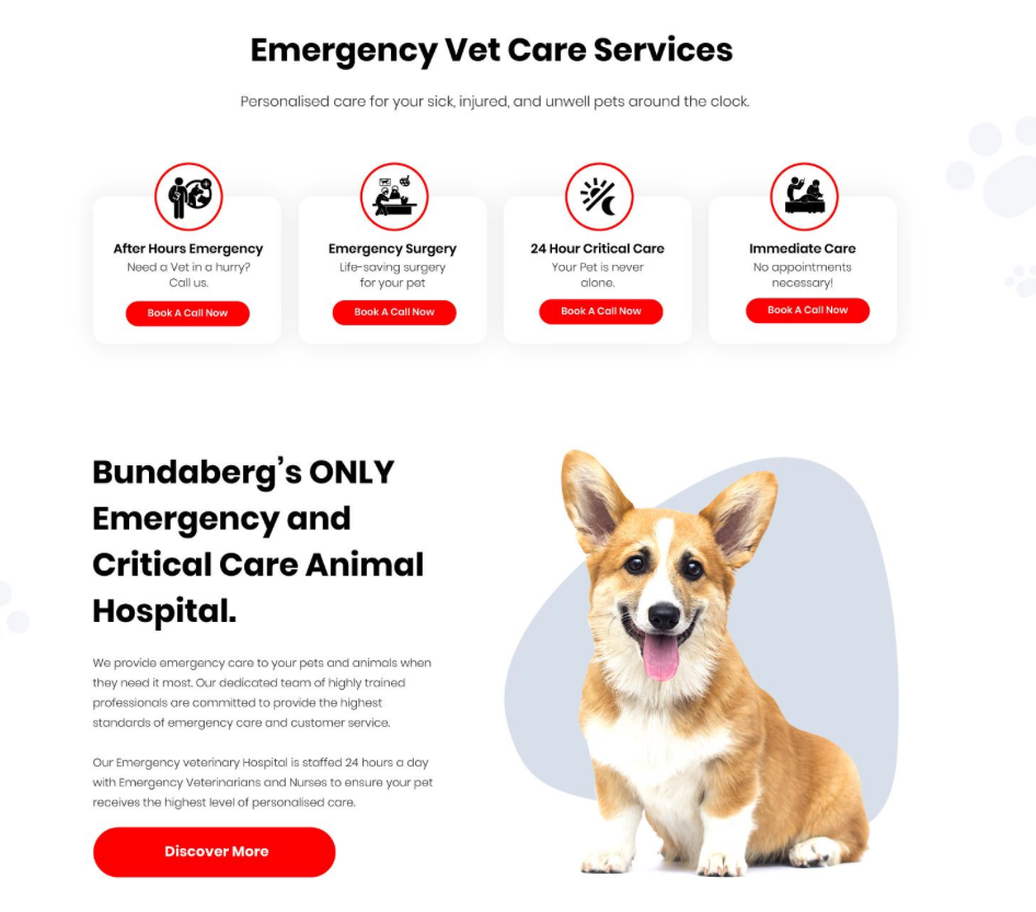
See how the various elements — the images, value propositions, etc — all work cohesively to make you want to call them.
Sometimes the issue isn’t “not having a CTA” but having far too many.
It could hurt your conversion even more when they’re equally weighted as you can see here:

Sugarland Animal Hospital: (“Before”)
When none of the CTA’s are emphasised, then nothing grabs our attention.
By the way, notice the kind of images they used as well. It depicts a dog that looks unwell or in pain. This puts the emphasis on the problem that they are solving for the pet owners.
Compare the above to the one below…

Sugarland Animal Hospital Homepage: (“After”)
We narrowed down the CTA to two. Notice how one is emphasised and the other : “Take a Tour” is subdued.
Also notice how we took a different approach: we used an image of a healthy pet and a happy human! In short, we highlighted the end result that the customers are after.
Call to Action Do’s:
- Make them big, bold and unmissable.
- Use words that clearly state what benefits they stand to get if they click. (e.g., “Start your FREE Trial Now”, “Book your no-obligation 20-minute consultation now”)
- Be strategic when considering their placement.
- CTA’s are part of a whole. They’re made compelling by the other elements appearing around it or before it. So pay attention to your UVPs and credibility-builders.
Call To Action Don’ts:
- Don’t use bland, generic words like “Submit” or “Enter”. The key is to make it clear what value or transformation they will get if they perform the action.
- Don’t make it blend into the background. Contrast is key here.
- There’s such a thing as good timing. When you ask users to perform an action before you even give compelling reasons to do it is one example.
- Don’t set the wrong expectations. Nobody likes bait and switch tactics.
Lesson 7: Set up the correct Conversion Goals and track them properly (or you know nothing).
“You know nothing, Jon Snow.”
Yeah, you don’t want to be Jon Snow.
Setting up the right goals in your Analytics will allow you to gather information that you can then use to fine-tune your campaigns.
When your prospects use Google search, it’s impossible to lump all of them into one single, clean-cut category, right?
Some are in a specific location, using a specific device, belonging to a certain age group, etc.
To optimise Google Ads and our Landing Pages, we need to gather data that will tell us game-changing intel, like:
- Which demographic is converting way more than the others?
- Which keywords are worth investing more ad spend on?
- Which months, days or times of the day people are more likely to convert?
- How well do people on desktops convert compared to those who interact with our pages using their phones or tablets?
- These are just a few examples of data that we can use to fine-tune our campaigns.
To make this more concrete in your mind, pretend that for the campaigns we’ve been running, the 35-45 yr old females within 8 mile radius of postcode XXX during the times 4pm to 8pm are converting like crazy.
If we don’t know this, then we’ll just be blindly throwing money on everyone and everything.
But if we have this intel, then we can stop investing in the “duds” and ramp up our efforts on targeting this hot demographic.
Combine that with a properly set CONVERSION TRACKING, and you, my friend, have got a golden goose in your hands.
But you see, this is something many businesses get wrong.
They either don’t set up the conversion tracking correctly or not set them up at all.
This creates “data noise” in the console.
It becomes challenging to identify the components that we should be abandoning and the key ones that we should be investing more on.
Here’s an example of a “bad” tracking setup:
Pretend you’ve set it up to track the page views.
Suppose 10 visitors converted.
In this case, because we’re only tracking page views, then we have no idea which of those people converted by signing up to our email list.
How many converted by buying something?
How many converted by phone call?
Because we’ve set it up to only track the page views and not the conversion action, then all we know is 10 “converted” in one way or another.
Tracking page views doesn’t give us actionable insights.
What we really want is to track the right metrics:
- Contact form enquiry
- Phone calls from ads
- Calls from website
- Transactions
- Sign ups
- Clicks to call
In the console below, you can see:

(Get to this page by clicking Segment Icon > Conversions > Conversion Action)
Out of 761 total conversions:
- 93.87 converted by registering as users (they signed up).
- 480.6 bought something from the online shop.
- 2.25 were calls from the website.
- 14.70 were enquiries via the contact form.
Armed with these, you can now bid more aggressively using the right elements.
You can also fine-tune by adjusting the period of time you’re analysing (e.g., 30-60-90 day periods).
Don’t go too granular though because you want to allow for seasonality’s in your industry to not skew your conclusions.
There’s far more to Conversion Tracking, of course.
We haven’t even touched on game-changing practices when it comes to setting up the following:
- Google Tag Manager (GTM)
- Google Ads call tracking
- Connecting Google Ads with Google Analytics
- Form Tracking using GTM
- Form tracking using events in Google Analytics
These are just some of the many ways we fine-tune your campaigns to make sure they perform in ways that exceed industry standards.
I know these can be overwhelming if you’re not familiar with Google Ads or Analytics.
That’s why I offer a 30 minute, no-strings-attached video audit.
I will evaluate your website, ads, SEO, and help you exploit any improvement or growth opportunities.
All you need to do is…
Book Your Free 30 Minute Audit With Me
Your Landing Pages are a vital point in your funnel because it’s the first page your prospect sees.
If they do a good job, they convert cold prospects into leads or customers. If they suck, then it’s hasta la vista baby!
They are either open floodgates channelling tsunamis of warm leads to your cash register (KA-CHING!) or they’re major choke points that are preventing your business from breathing.
Improve their performance and you’ll enjoy tremendous improvements in business
outcomes.
A well-optimised Landing Page:
- Improves your Google Ads Quality Score (QS)
- Lowers your Customer Acquisition Costs (CAC)
- Boosts your Conversion Rate (CR)
- Maximise your Return On Ad Spend (ROAS)
…and puts a big, fat smile on your F-A-C-E 😉
So if you feel your landing pages are underperforming and you want to get more results from your Google Ads campaigns…
Get your free audit where I run through your website, SEO, Google Ads, and whatever else you’d like me to evaluate for you.
Then I provide you with a no-strings-attached video of the audit.
Don’t worry, this is not a sales call. We offer this because we like providing as much value as possible.
Book your FREE 30-minute strategy call including a no-obligation video audit here.